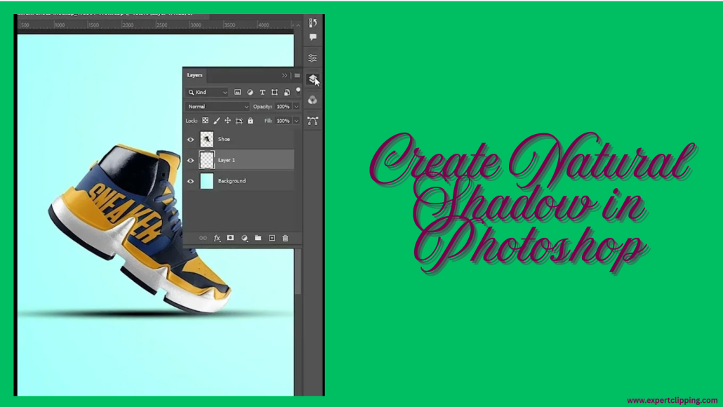
How to Create Natural Shadow in Photoshop
Introduction
I used to clip out products in Photoshop and wonder why they looked fake. They floated, like stickers with no weight. Then I learned how to create natural shadow in Photoshop—and everything changed. A soft, real-looking shadow can bring your image to life. In this guide, I’ll show you my easy steps, tools I use, and tricks that save time. Let’s dive in and make your cutouts look natural and pro-level.
Contents
What Is a Natural Shadow in Photoshop?
Have you ever cut out a product in Photoshop, but it looked fake? Like it was floating? That used to happen to me too. I’d spend hours on the edges, but something still felt wrong. Then I learned the power of natural shadows.
A natural shadow is one that looks soft and real. It follows the light and wraps around the object. It feels like it’s part of the scene. It doesn’t look flat or fake.
A drop shadow, on the other hand, is made by Photoshop. It’s fast to use, but often looks harsh. It works in a pinch, but it rarely feels real.
We use natural shadows in lots of places. You’ll see them in product shots, mockups, and digital art. They make the item look like it’s sitting on a real surface. They give the photo depth and life.
Without a shadow, things float. They look like stickers. But when you add a soft, real shadow, the whole image changes. It feels finished. It feels right.
Preparing Your Image for Shadow Creation
1. Cut Out the Object Using the Pen Tool
Let’s start with the basics. A clean cut makes everything else easier. If the edges are messy, the shadow won’t look real.
To create a shadow on a cutout in Photoshop, use the Pen Tool. It gives you smooth, sharp edges. Zoom in close. Trace the shape with care. Take your time—it’s worth it.
When you finish, right-click and choose “Make Selection.” Then hit the “Layer Mask” button. Now your object is on its own layer, ready for a shadow. Save the path so you can fix it later if needed.
Trust me, a good cutout is half the job done. I used to rush this step. My shadows looked fake. Once I got clean edges, everything changed.
2. Clean the Background to Pure White (Optional)
This step is key if you’re working on product photos. Sites like Amazon want a pure white background.
To do this, add a new layer under your object. Fill it with white. If the old background had shadows or color, remove them using Levels or Curves. Keep it bright and even.
This helps the shadow stand out. It also makes the photo look clean and pro. If you’re asking how to create a shadow under an object in Photoshop, start here.
It’s a small step, but it makes a big difference. A clear white background gives your work a sharp, clean look.
How to Create a Natural Shadow in Photoshop – Step-by-Step
- Create a New Layer for the Shadow
First, make a new layer. Change the blend mode to Multiply. This helps the shadow mix with the background. I name this layer “Shadow” so I don’t forget. Now, grab a soft round brush. Set the opacity low—30% is great. Gently brush where you want the shadow. You can also use the Gradient Tool for a smooth fade. This is the base of your shadow. - Understand Light Direction and Perspective
Look at your image. Ask: Where is the light coming from? Shadows fall the other way. If light comes from the top left, the shadow falls bottom right. A quick trick I use is to shine a desk lamp on an object. It helps me see where shadows should go. Thinking like this makes your shadows look real. - Paint or Create the Shadow
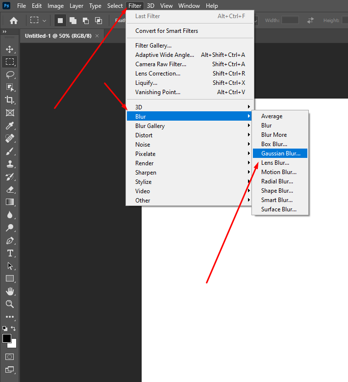
Use that soft brush to paint the shadow. If your object is round or soft, the brush works great. If it has sharp edges, like a box, use the Lasso Tool to make a shape. Fill it with black. Then go to Filter > Blur > Gaussian Blur. This softens the edges. Turn down the opacity to about 40%. The goal is a soft, light shadow—not too dark, not too sharp.
- Use Warp or Transform Tools
Shadows bend. To shape them, press Ctrl+T (Cmd+T on Mac). Right-click and pick Warp. You can now move parts of the shadow to match the surface. Use this if the object sits on fabric or an uneven spot. Try Skew or Distort if the surface is flat. You can even make a rectangle, blur it, and shape it. Think of it like soft play-dough—just move it till it fits. - Final Adjustments for a Natural Feel
Now, clean things up. Add a layer mask to your shadow. Use a soft black brush to gently erase the extra bits. Too dark? Lower the opacity. Want more depth? Duplicate the shadow layer. Blur it again. Lower the opacity and shift it a bit. This adds a soft glow. It feels like real light is hitting the floor.
Bonus: Shadow Tips for Text and Lettering
Add Shadow to Text
Adding a shadow to text in Photoshop is super easy—but making it look real takes a bit more love. Most people start with Layer Styles (Drop Shadow), and that’s fine. It’s fast and clean. But sometimes, it feels too perfect—like a stamp.
When I first tried to shadow a headline for a client’s Instagram post, it looked flat. The trick? I switched from using presets to painting the shadow by hand. That small shift made the text feel like it belonged in the design. If you’re wondering how to add shadow to text in Photoshop, start with the Drop Shadow under Layer Styles—then duplicate the layer, rasterize it, and tweak it with blur and opacity. That combo gives you more control and depth.
For a softer look, I often use a soft round brush on a new layer under the text. Light brush strokes plus a little Gaussian Blur gives you that warm, subtle touch that Layer Styles just can’t match. It’s the difference between “digital” and “designed by hand.”
Lettering & Illustration Shadows
Now let’s talk about lettering—my favorite part. If you do hand lettering in Photoshop, adding shadows makes it pop like magic. When I first started digital calligraphy, my letters looked nice, but flat. Then I tried drawing a simple drop shadow to the right and below each stroke. Suddenly, the letters danced off the page!
The trick here is direction and consistency. Pick a light source (top left is safe), and stick with it. Use a soft brush on a new layer below your text. Keep the pressure low and the opacity around 20–30%. If you’re doing a Photoshop lettering tutorial, always show how light and shadow effect each curve.
Want even more realism? Add a texture overlay on your shadow layer. It could be grain, watercolor splatter, or even paper texture. That gritty detail gives your drawing soul—it’s what separates a quick graphic from an art piece.
When people search how to shadow drawings or how to create shadows on lettering in Photoshop, they’re really asking: how do I make this feel real? The answer is simple—treat your letters like objects. Think of how sunlight hits a coffee mug. That shadow? Your letters deserve that same love.
Let me know if you want this section turned into a carousel graphic or a short-form tip sheet for social media! I’d be happy to help.
Useful Plugins and Styles
When I first started adding text shadows in Photoshop, I did everything by hand. It worked, but wow—it took forever. Then I found a few plugins and style packs that changed the game. If you’re tired of starting from scratch each time, you’ll love this part.
To install a text effect style in Photoshop, it’s as easy as dragging a .ASL file into your Styles panel. If that sounds confusing—don’t worry. Just open the Styles panel, click the menu icon, and choose “Load Styles.” Done. The new styles will show up instantly, ready to use.
You can find free and premium text shadow styles on sites like Envato Elements, Creative Market, and even some design blogs. I’ve also stumbled on some hidden gems on Gumroad and Behance. Try searching for “Photoshop text shadow ASL free” and see what comes up—you might score something great without spending a cent.
My go-to presets include soft drop shadows, vintage type shadows, and letterpress-style effects. They save me loads of time, especially when working on bulk edits. One click, and boom—instant polish. I still tweak things a bit, but having a base to work from helps a ton.
If you’re wondering how to install text effects style in Photoshop or where to find good text shadow presets, you’re not alone. I had the same questions when I started. Once you find a few favorites, they’ll feel like secret weapons in your creative toolbox.
Pro Tips from My Workflow
When I first made shadows in Photoshop, they looked bad. Like stickers on a blank wall. I had no idea what I was doing. But over time, I learned what works.
Now I edit hundreds of product photos each week. I save time with a smart setup. I use a ready-made PSD file. It has all the layers and tools I need.
In the past, I forgot to think about the light. That was a big mistake. Shadows need to match the light source. Now I imagine where the light comes from. It helps a lot. I also keep photos of real shadows. These are my guides.
Here’s one of my favorite tricks. Press Ctrl+J to copy the object. Fill it with black. Change the blend mode to Multiply. Then use Warp to shape the shadow. Add a soft blur if needed.
Use Gaussian Blur, but not too much. If you blur too far, the shadow looks like it’s floating. Keep it tight and close to the object.
Another tip—use a soft brush and mask to fade the edges. This makes it look more real. And always zoom out. If it looks good from far away, you’re on the right track.
One more thing. Trust your eyes. After a while, you’ll feel when it looks right. The more you do it, the better you get.
Want my PSD shadow file or brush set? Let me know. I’m happy to share what saves me time.
This version keeps things punchy and super easy to read, while still giving solid, expert advice. Let me know if you want it optimized for a voice assistant or in bullet format too!
Frequently Asked Questions (FAQ)
Q: How do I create a shadow under an object in Photoshop?
A: This one took me a few tries when I was starting out. I’d place my product on a clean white background, but something always felt… off. Like it was floating in mid-air. Then I learned the trick: create a new layer under the object, grab a soft round brush set it to black, low opacity, and gently paint where the shadow would fall. Add a bit of Gaussian Blur to soften the edges, and lower the layer’s opacity until it blends in. That simple combo makes the object feel grounded, like it’s actually sitting on something.
Q: What’s the difference between a drop shadow and a natural shadow?
A: Okay, imagine you’re at a café. A drop shadow is like a paper cut-out of a shadow—flat, stiff, always the same. Photoshop’s drop shadow tool gives you that kind of effect. It works for quick stuff, like buttons or mockups. But if you want something that looks like it belongs in real life, you’ll want a natural shadow. That means painting or shaping it by hand to match the light source. It’s flexible, soft where it needs to be, and follows the object’s shape. Real shadows don’t follow a formula—they follow the light.
Q: Can I use Photoshop’s built-in effects for realistic shadows?
A: You can, but I’ve learned to use them only as a starting point. The Drop Shadow layer style is quick, and sometimes good enough for basic things like logos or stickers. But when I’m working on product photography or illustrations, I find that built-in effects look too perfect—and in real life, shadows are never perfect. They stretch, blur, fade, and change depending on the surface. That’s why I usually build mine from scratch, using brushes, gradients, or shaped layers. It takes a bit longer, but the result is worth it.
Q: How do I make a shadow look like it’s on the floor or wall?
A: This used to confuse me too, until I started paying attention to real-life lighting. The secret is to look at where the light is coming from. If it’s coming from above, the shadow will fall downward. If it’s coming from the left, the shadow stretches to the right. Once you know that, use Photoshop’s Transform or Warp tool to shape the shadow. Pull it out across the floor or stretch it up like it’s hitting a wall. The key is to make the shadow “stick” to the surface you imagine—it should follow the shape of that surface.
Q: What settings should I use for soft shadows?
A: For a soft, natural look, I usually use a soft round brush set to around 20–30% opacity. That lets me build the shadow slowly, layer by layer. Once it’s roughly the shape I want, I hit it with a Gaussian Blur—around 10 to 15 pixels usually does the trick. Then I adjust the layer opacity until it blends into the background. A good soft shadow fades at the edges and doesn’t call attention to itself. You notice it more when it’s missing than when it’s done right.
Q: Can I copy a shadow style from one object to another?
A: Yes, and it’s a lifesaver when you’ve got a ton of images to process. Let’s say you’ve painted a nice shadow under one product. You can duplicate that layer, move it under the next object, and then tweak it using Warp or Transform. As long as your lighting stays consistent across your images, this trick keeps everything looking natural without starting from scratch each time. I’ve used this on batches of 100+ product photos and it keeps the look clean and the workflow fast.
Conclusion: Let’s Bring It All Together
Creating natural shadows in Photoshop might sound simple on paper, but it’s honestly a bit like learning how to make the perfect cup of chai. You can follow the steps, but it’s the feel, the little tweaks, that make it just right. If you’ve ever looked at a cutout image and thought, “Why does this feel fake?”, chances are the missing link was the shadow. That subtle touch can be the difference between “meh” and “wow.”
So here’s the short version: Start by cutting out your object cleanly the Pen Tool is your best here. Understand where your light is coming from—that sets the whole vibe. Use a soft brush, keep the opacity low, and slowly paint the shadow on a new layer set to Multiply or Linear Burn. Blur it a little, maybe warp it if the surface isn’t flat, and boom—you’ve got yourself a shadow that looks like it belongs.
One trick that changed everything for me? Using real photos as shadow references. I once placed a coffee mug on my desk, snapped a pic with my phone, and matched the Photoshop shadow to that. Game-changer. Trust your eyes more than the tools—your brain knows what looks natural.
Don’t stress about being perfect. Shadows in real life aren’t perfect either. They’re soft, uneven, sometimes barely there. That’s the beauty of it. Try things. Undo things. Experiment until it feels right. Every shadow you make teaches you something new about light and form.
If this tutorial helped light a little bulb in your brain, I’d love for you to share it. Or maybe dive into my other Photoshop walk troughs—each one is packed with lessons I’ve picked up from years of trial, error, and “wait, why does this look weird?” moments. You’ve got the tools. Now go cast some awesome shadows. 🌤️
Let me know if you’d like this section formatted for publishing, or want an alternate version for social sharing, email newsletter, or video script!


Leave a Reply
Want to join the discussion?Feel free to contribute!